COMPLETE BUSINESS SIGNAGE MANAGED FROM DESIGN TO INSTALLATION
We simplify the signage process for Sydney businesses and project managers. Whether it’s a single shopfront or a multi-site compliance rollout, we manage the design, standards, and installers so you don’t have to.
THE VISIBILITY GAP
Your signage either brings customers in or sends them elsewhere
Does Your Business Look as Professional as the Service You Provide?
A tired shopfront or a blank vehicle is a wasted lead. If your physical presence doesn't command attention, you're handing customers to your competitors. We turn your physical assets into high-performance marketing tools.
Is Your Signage a Business Asset or a Brand Liability?
From confusing wayfinding to tired shopfronts, poor signage creates friction for your customers. We transform your premises into a seamless, high-impact environment that simplifies navigation and strengthens your brand.
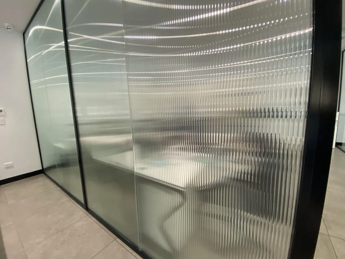
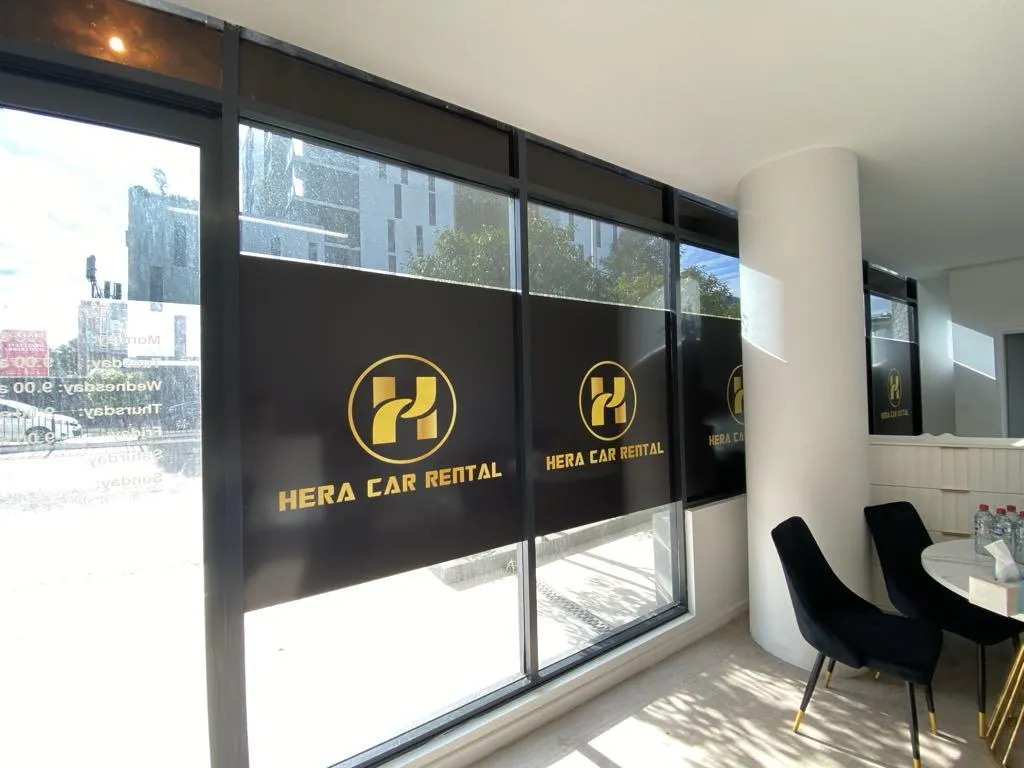
OUR SERVICE
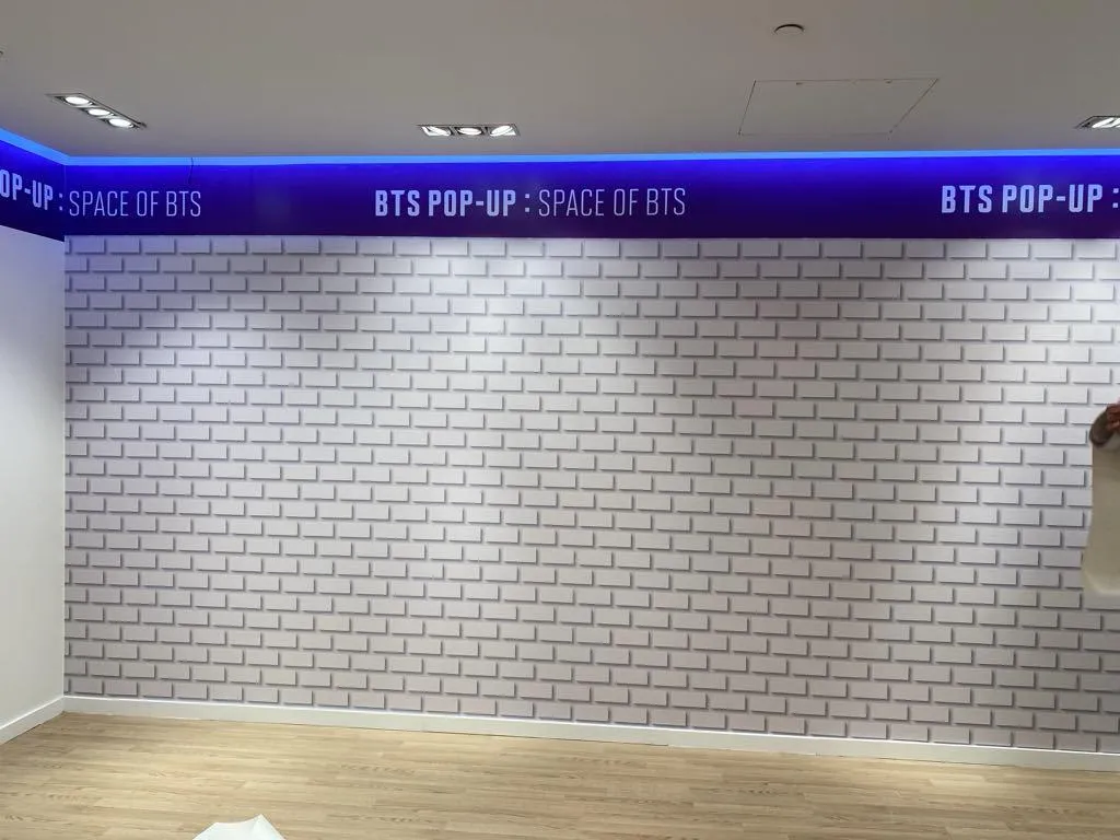
Professional branding for every part of your business
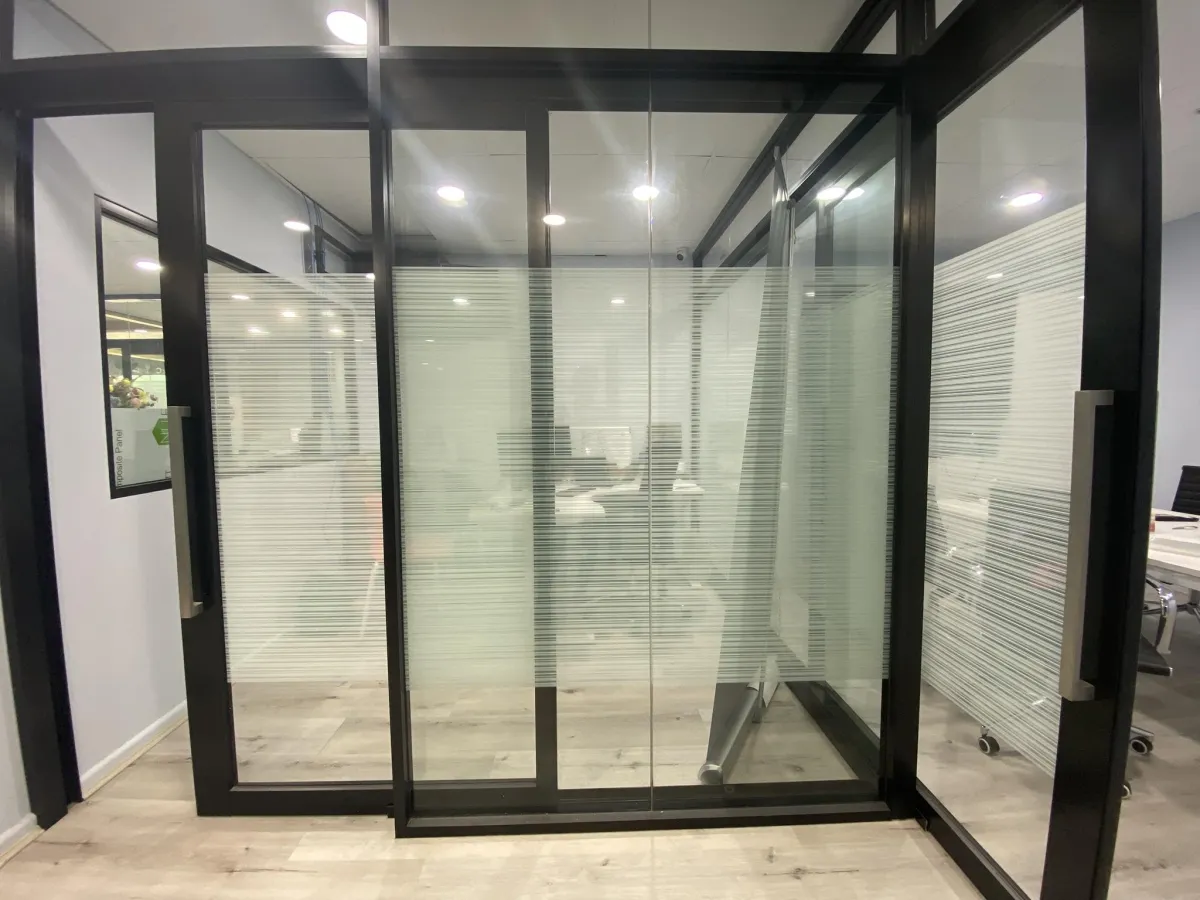
Compliance signs
Clear directional signage for offices, facilities and construction sites.
Learn more →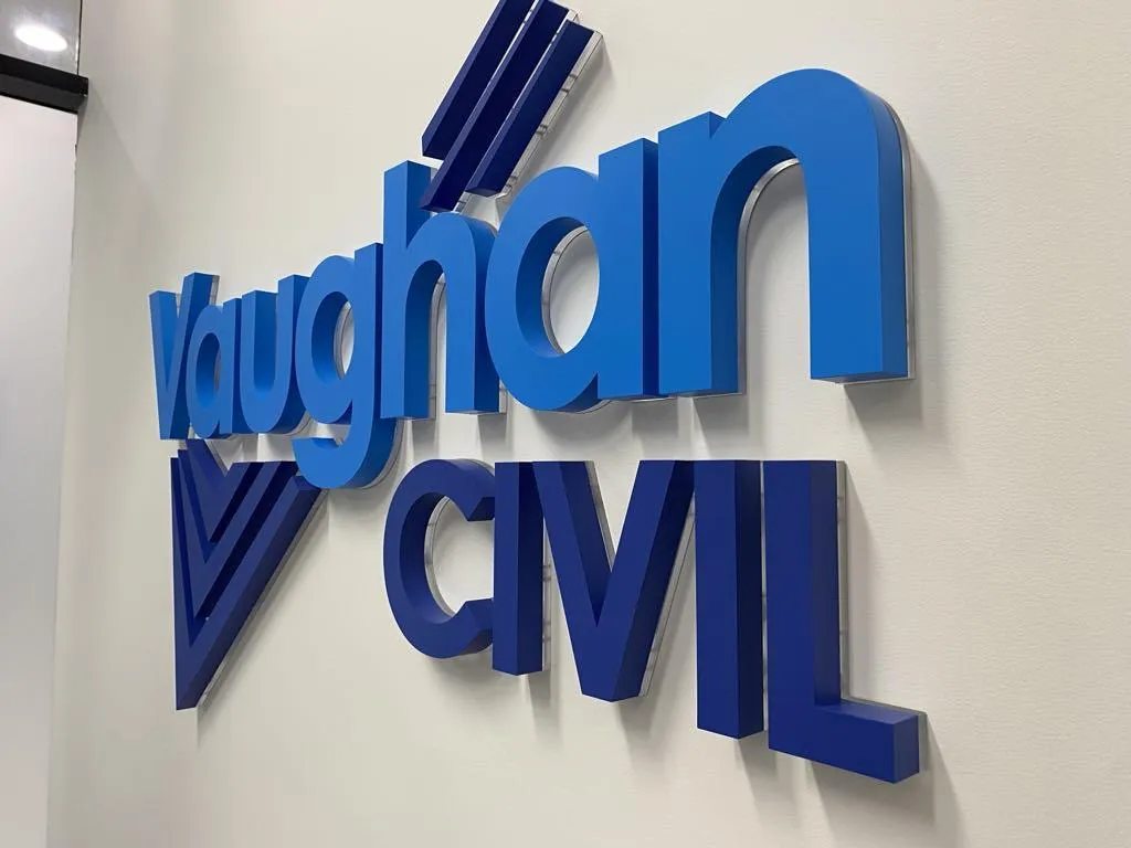
WHO WE WORK BEST WITH
We work with businesses, builders and organisations
Business owners who invest in their signage because it represents their business
Retailers, clinics, corporates and government teams who need it done properly the first time
Construction PMs who want a reliable signage partner for every project
OUR PROCESS
Every service, managed from brief to installation
Tell us about your project
Share your location, sign type and timeline. The more detail you provide, the more accurate your quote will be.
Receive your quote
A clear, detailed quote based on your site, sign type and requirements. No guesswork, no hidden costs.
Confirm and deposit
Accept your quote and pay your deposit. Your project is confirmed and your place in the schedule is locked in.
Artwork and your approval
We prepare your artwork and send it for review. Nothing moves to production until you have signed off in writing.
Production underway
We manage production through our professional supplier network and keep you updated throughout.
Installation and handover
We install your signage, complete a final quality check and hand over once everything meets the agreed standard.
WHY US
We deliver clear process and clean results
SIGNSEEK is a Sydney signage service built on process, precision and follow through. One contact manages your project from brief to installed result. Clear quotes, no surprises, and a final quality check before we leave the site.
NEED ANSWERS?
Common questions are asked
Every signage project is custom so there is no single answer. Pricing depends on the sign type, size, materials, complexity and what is involved in the installation. A simple set of cut vinyl letters for a small shopfront sits at a very different price point to a full set of illuminated channel letters on a commercial building. The most accurate way to get a real number is to share the details of your project with us. The more specific you are, the more precise your quote will be.
Most standard projects are completed within 2 to 4 weeks from artwork approval through to installation. More complex projects involving custom fabrication, larger formats or specialist materials can take longer. We give you a clear timeline at the quoting stage and keep you updated throughout so there are no surprises.
A description of what you need and where it is going is a good starting point. Photos of the space or location help considerably. For branded signage, your logo needs to be in a vector file format such as AI, EPS, SVG or PDF. If you only have a JPG or PNG we can discuss options with you before quoting. The more detail you share upfront, the faster and more accurate your quote will be.
We manage the full project from brief to installed result. Once you share your concept, logo, brand assets and any inspiration or references you have, we prepare the artwork layout specific to your space and sign type. You review and approve it before anything goes to production. Nothing is produced until artwork is approved in writing.
We work with retail stores, restaurants and cafes, medical and allied health practices, corporate offices, schools, government facilities, construction companies and tradies. If your business needs signage that is professionally designed, produced and installed in Sydney, we work with you.
Yes, in most cases. Illuminated signs that need to be hardwired into your building's power supply require a licensed electrician to make that connection. This is outside our scope and is the client's responsibility to arrange. We identify this requirement at the site assessment stage and let you know exactly what needs to be organised before installation can be completed. For signs that run from a standard power point, no licensed electrician is required.
We review your enquiry and get back to you within 1-2 business day. If you have shared enough detail about your project, location and sign type, we can often provide early guidance on approach and an indicative price range straight away. For larger or more complex projects we will arrange a site assessment to measure up and confirm requirements before providing a detailed quote.
Yes. We service businesses across the Greater Sydney area within a 100 kilometre radius. This covers the Sydney CBD, Inner West, Eastern Suburbs, North Shore, Northern Beaches, Western Sydney, Parramatta, Penrith, the Hills District, St George and the Sutherland Shire. If you are unsure whether your location is within our service area, get in touch and we will confirm.
GET STARTED
Give your business the presence it deserves
Tell us about your project and we will give you an accurate quote and a clear plan.
ABOUT YOUR SIGNAGE
Copyright 2026. SIGNSEEK. All Rights Reserved.